
Friday, May 9, 2008
Old media Blog- The Canvas

Wednesday, May 7, 2008
A new Me!

Wow, what a good looking guy, huh? This is my Avatar, Danson Laks. I tried to make him look like me as much as humanly possible. My first time on Second Life was very, very interesting. I circled around a supposed female for a bit as if she was an inanimate video game character until she said "Can I help you, Danson?" At this point I realized that Second Life gives you actual human interaction. I made friends with the Avatar I was accidentally pestering, but I realized I was in a REAL SOCIAL SITUATION where awkwardness was present. We can say some awful things on the internet. When we are cars on a highway, where you are visually and sonically separated by two thick layers of glass, you can swear at the top of your lungs, swerve at "idiots" and beep until your heart is content just because you can't see or hear the people you are cursing at. In the internet, things aren't much different. Some renegade bloggers can be extremely offensive with what they say in blogs, but I doubt they carry the same opinions in the real world. In Second Life, you actually can see and hear people. I couldn't punch my new friend's avatar in the mouth or say mean things because virtually, she was standing right next to me. My little brother moved back home from Boston for the summer and he signed up for Second Life because he was there watching my first experience. We walked around, flew about, and chewed the fat. It was far more real to me than emailing back and forth and it was far more visual than chatting on the phone. I really "hung out" with my little brother and it felt like I was because we look so much like our real avatars.
Wednesday, April 30, 2008
I LOVE LUCY!


I LOVE LUCY! I really do!
Ever since I was a little girl watching reruns of I Love Lucy on Nick at Night, I have been captured by and down right addicted to the television series that set the tone for not only production and cinematography of television and film, but the de-polarization of traditional gender roles during its time. I chose to focus on I Love Lucy because it represents and intertwines so many aspects of visual culture.
I Love Lucy brilliantly debuted during an important moment of American history when technology moved entertainment from radio and film to an in-your-home simultaneous audio and visual stimulant called the television. American families now had a deeper connection with the stars they were watching in their living rooms every evening after dinner, and Lucille Ball and Desi Arnaz used this to their utmost advantage. I Love Lucy was particularly unique due to the real life marriage between Ball and Arnaz which translated from their private life into their public, on screen scripted marriage. The actors played off the public's knowledge of their real life relationship, blurring the lines between realism and resemblance, causing an even greater effect on the viewing audience.
I have created an artistic 3D sculpture painting that illustrates three of my favorite episodes, but more importantly represents some of the major revolutionary anti-domestic ideals that I Love Lucy was famous for portraying. In each smaller hanging panel is an example of a particular moment where Lucy Ricardo is pushing her way through the traditional, unbending roles of what women in the 1950's were suppose to play. In Episode 56 entitled "Equal Rights" Lucy and Ethel demand their husbands to treat them as complete equals and as a result the men refuse to pay for their dinners later that night at a restaurant, therefore the girls end up having to wash dishes to pay for their meals. And to stay true to the situational comedy, the girls get even (as they always do) and fake getting held up in a robbery, throwing the men in jail to teach them a lesson.
Woman all over the United States recognized a little bit of themselves in Lucy Ricardo: the liberated crazy, looney, comic - a role known to only be suited for a man. Women identified with Lucy who was a lady ahead of her time, as the feminist movement did not reach it's hey day until the 1960's and 70's. Yet in 1951 I Love Lucy was revolutionizing the way society viewed gender and helped pry open the vice gripped around the polarization of men and women in the home and work place blending these worlds together.
Episode 39 is probably the most well known I Love Lucy to have aired, entitled "Job Switching". Here Lucy and Ethel speak for woman across the nation as they moan and groan over the repetitive dullness of cooking and cleaning, which was prompted by Ricky complaining about the pains of making a living in. The men of course challenge the woman to a contest to switch jobs and see who can last the longest. While the woman realize they aren’t cut out for chocolate factory work, the men have a revelation of their own when they encounter a disaster attempting to make dinner and almost burning the kitchen down. The episode resolved back into the traditional lines of domestication where Ricky went back to making the living and Lucy went back to being the housewife, setting audiences at ease who were not quite ready for such a bold social move forward.
The larger main canvas is painted using acrylic and has flowing spiral red ribbon to mimic the fabric behind the big heart during the opening title of the show. Lucille Ball and Desi Arnaz are fixed in the middle of the art, as the household icons. People fell in love with the Ricardo's because they knew parts of the Ball/Arnaz family's real life was connected to what they saw on camera, and that made watching even more alluring. Lucille Ball played the first openly pregnant woman on television as she was expecting in real life. It was playing variations of their real off screen lives that lead to that intimacy and connection for the viewers. It was the everyday life inside the home of a hilarious yet fearless couple that tugged on the strings everyone's hearts. Even to this day, almost sixty years later, the show still communicates to audiences, and I am a prime example. Back then heterosexual couples looked toward the Ricardo's as their prime example of love and middle aged housewives looked toward Lucy Ricardo for what they hoped they someday could be. Now we look back with nods of approval that we might possibly not have had, had the world not been given Lucy Ricardo, the unconventional and revolutionary female model.
New Media

Although gaming isn't necessarily "new" media, it is relatively new within the past 50 or so years and continues to lend itself to newer and more advanced technologies. I took this opportunity to delve into the vast subject and educate myself. This is what i found...
A video game is a game that involves the interactivity of the player(s) through a user interface generating visual feedback on a video device. Some fun facts: Half of all Americans between 12-55 play video games, video games have been known to help children with following directions, problem solving and logic, learning computer technology, practicing fine motor and spatial skills.
First and foremost- the platform: electronic hardware in conjunction with software allowing the game to operate. Examples are: PC game is where player interacts with personal computer hooked up to a video monitor, console game is a specialized device that connects to a TV or video monitor, arcade game is designed in special cabinet enclosure for specific one game, and hand held game is self contained device that is portable. Although we cannot forget online and wireless games too!
Input devices is the controller and this ranges depending on the platform of the game.
History and Development:
The world’s first video game was invented in 1958 with “Tennis for Two” by William Higinbotham on an oscilloscope. The first commercially sold, coin operated video arcade game was “Computer Space” in 1971 by creator Nolan Bushnell and Ted Dabney. First home console was Magnavox Odyssey in 1972 used a standard television and game generated video signal. Next came ATARI with “Pong” in 1972 with an arcade version and a home version in 1975.Of course as the years went on newer editions of both Atari’s Pong and the Magnavox Odyssey appeared.
Released in 1976, Wonder Wizard 7702 was built using the Magnavox Odyssey circuit board and casing, but with the “Wonder Wizard” name on the top. The same year the Coleco Telstar (Coleco’s first video game) appeared and was the first system to use GI's AY-3-8500 chip, which proved to be very successful. The chip allowed 6 games to be played with more levels of difficulty and in color. Over the years, Magnavox came out with the Odysseys 300, 400, 500, 2000, 3000, & 4000. The Fairchild Channel F came out as the first programmable video game on the market with plug in cartridges containing ROM and microprocessor code rather than dedicated circuits.
Modern day video games:
Through the 70’s and 80’s Atari, Magnavox, Coleco kept releasing newer and more advanced video game systems as technology gave way. Although in 1980 Mattell entered the gaming market with Intellivision system that offered 12 games with better graphics and sounds than other competitors. In 1985 Nintendo Entertainment System was released and gave way for one of the world’s most popular video games. The next year Sega entered the console gaming market with the released of Sega Master System, followed by Sega Genesis in 1989. Now the modern gaming market is heavily controlled by Nintendo,
Sony, and Microsoft.
Gaming hey day:
Consoles are the most popular video game medium and the leader in video game platform sales. Today the video game industry is in it’s hey day and by the looks of things, it will only continue to rise. Right now the most popular games are Nintendo’s Wii, Sony’s Playstation 3, and Microsoft’s Xbox 360.
What lies ahead:
Gaming Industry is considered above average growth sector of the global entertainment industry and will continue to out weigh music and film through 1011. $633 million spent on game rentals. $6 billion spend on gaming software. 4.5 times VHS & DVD sales combined. Today the gaming industry out weighs the record industry and film industry COMBINED
Predictions….
By 2011 the worldwide gaming market will be worth $48.9 billion. 12.5 billion in U.S. region. Asia-Pacific region remains highest overall spending on games and will reach 18.8 billion. Gaming growth rate is second highest in Africa, Middle East, & Europe. Composers for film are now turning to composing for games. This no doubtedly will become an increasing trend for musicians taping into this stream of income.
Tuesday, April 29, 2008
TV Culture
Friday, April 25, 2008

This is my avatar I created on SecondLife. Let me tell you I think this program is lame! It wants to be a game so bad, but it just isn't fun. Growing up with the development of games I know what is capable for online games. And this is so badly executed that it hurts my brain the play it. Now I know it's not supposed to be a game, but, come on, it looks like a game, has many of the same controls of a game, it just has no purpose/story/achievement/fun that are associated with any decent game. The connection to the server of SecondLife is awful (i.e. it LAGS). The graphics are terrible, if this was around 10 years ago it might be an accomplishment, but it's not, so it sucks. I found it so confusing to figure out where to go and what to do, not intuitive at all.
Secondlife does nothing new and exciting. It's just a big, over-glorified chat room. Games like World of Warcraft, EverQuest, and any other Massively Multiplayer Online Role Playing Game (MMORPG) have been doing this for years, but with a game attached to the "chat room" making it enjoyable for the "video game generation".
I could only tolerate SL for about half an hour so some might say I never gave it a chance. But to them I say a "game" is like an album in that it must captivate the audience within the first couple of minutes or it has lost them. And SL just lost me.
SecondLife might be cool for someone who has never seen or played a MMORPG (or any online game for that matter), but for the millions who have, it's a mediocre attempt at entertainment and networking which is headed in the direction of the Sega Dreamcast (i.e. DEAD) unless they make some major changes.
Tuesday, April 22, 2008

At our last visit to the MFA my partner and I looked at this giant sarcophagus lid in the Egyptian Funerary exhibit. The idea and purpose of this piece is obviously to protect and honor the deceased person inside the coffin. It is composed on rock, more specifically, basalt. The sculpture is very iconic, not individual or realistic in the least. The structure is interesting, but not unique in the Egyptian idiom. Showing only the head on top of a body shaped stone covered in hieroglyphics that give us some kind of message from the deceased. The sculpture was done by very skilled workers that were "hired" to create such a magnificent piece. The surface is awe inspiring, it's sheer size and quality of craftsmanship makes the viewer feel almost insignificant next to it. This piece is connected to many other ancient works that deal with death and honoring the dead. It is an elaborate tombstone.
I just found it incredible and it was cool to be able to look behind the piece (up against a wall) and see how it would have fit in the bottom half of the tomb. Being able to see that made it feel more real, unlike the paintings and "stuff" kept behind glass at the museum. It felt more real, and the viewer has a closer connection with this type of sculpture.
Thursday, April 17, 2008
iPhone-The Future Is In Your Hand

For my New Media presentation I chose to speak about the iPhone. This new wireless device has seemed to captivate audiences all over the world & is becoming the "must have of 2008," named the invention of the year by Time Magazine. For the first time you literally have the internet in your pocket. With the touch of your finger you can surf the web…check your e-mail…manage your contacts…listen to music…have visual voicemail…take pictures…record videos & much much more.
Tuesday, April 8, 2008
Internet Video
Some of my favorite internet videos from various sites:
Jake and Derek's Road Trip 2: The Lost Footage (from YouTube)
Nick Swardson video making fun of druggies (from Super Deluxe)
Lasse Gjertsen edits video into music (from Dailymotion)
Jake and Amir - "Lyrics" (from Vimeo)
Listen to me!
Most of the time these videos are filmed from built in computer cameras, or web cams mounted on the computer’s display. The “artist” in the video then introduces himself or herself, and begins singing to a karaoke track they have stored on their computer. Most of the time these singers are just starring blankly into their computer screens at their own image being filmed by the camera. They evoke emotion as if the song was their own, and as if they were performing for a live audience. However, much too often these home videos are of poor talent quality and potential, and to the artist’s surprise, the video actually becomes a worldwide form of comedic entertainment viewed by thousands made possible by the amazing YouTube.
Google Earth

Voyeurism is an old habit that has gained a considerable amount of popularity in recent years because of technology. Google Earth, an online map of the world, is quickly becoming an amazing resource for people around the globe. The concept of satellite images is nothing new, but making it available to the public is worth talking about.
Google Earth is a program for both Mac and PC that allows the user to “search” the globe. It’s possible to type in an address to see an aerial view of the location, zooming capabilities for close up shots or far away views to find directions, and a way to spend hours looking around. The feature that makes Google Earth an impressive program is its 3D capabilities. The view isn’t this flat image, but a 3D view of the world. Looking straight down into the Grand Canyon is an amazing sight, and looking straight down at people on the street is both fun and a tad bit creepy.
The peak of this program has yet to happen in my opinion. People are just beginning to take advantage of this amazing piece of software. Giant ads are being placed in desolate areas of the earth to promote various endeavors. The Simpson movie had crop circles of Homer and Maxim had a football field sized ad in the middle of the Nevada desert.
The future of this program is causing a lot of talk about National Security. The idea of being able to look down on the world is something exciting, but it may also be considered an invasion of privacy. Right now it’s only images, but in the future it’s very possible that we will be able to see the globe in video. It would be absolutely mind blowing to punch in coordinates and see live video of the earth, but is it appropriate? It’s an exciting thing to think about, but at some point we need to consider what is a useful piece of technology and what is necessary.
Monday, April 7, 2008
High Def Media...

No longer the realm of computer nerds and high budget film studios, high definition video has come to the masses. Advances in technology and mass production have lowered the price of HD capturing and viewing devices so much that the common consumer can be involved in this visual medium.
In fact, this past weekend I was involved in such an experience. The 48 Hour Film Festival came to Boston and I was on a team set to produce a short film in only 48 hours. We had the option to film in standard definition (480) for free, but opted for the HD camera (1080p) instead, investing some money for the upgrade. This was quite an experience, and the video looked crisp and clear, even while filming at night in the rain. Hopefully I will be able to show a clip of the film (in a compressed form however) during my presentation on this subject.
The image above is an example comparing HD to SD (Standard Definition) video. Its a frame from the movie, Terminator 2 : Judgement Day. The frame on the top is clearly the HD one, its crisp, undistorted image had much more detail than the SD frame below it. The color is more vibrant in the SD image, but not as realistic. The SD frame is stretched to fit into an aspect ratio foreign to the standard NTSC format. (I'm not sure what resolution the HD frame is in as the caption for the image was unclear)
The future of High Definition Television is looking bright, but who knows where it will take us. Maybe 3D is the next big leap?
Thursday, March 27, 2008
POV in Rear Window

Rear Window is a masterful work by Alfred Hitchcock. This film is all about Point of View, you are stuck with whatever L.B. Jeffries can see from his room and that is where all the action plays out. Hitchcock uses many techniques that use all kinds of POV tricks. The introduction of the camera lense for close-ups is very clever and realistic, you never see more than what Jeff can see. At the same time, there is an overlapping POV which is more of a narator, used in the opening shot to give us a perspective, and then zoom into Jefferies where we are actually seeing him; but most events we see through the Jeff's eyes. The camera is almost as free as can be, but the movements as very controlled and precise.
Another theme that incorporates POV is the fact that this movie is almost a film within a film. Jeff is stuck in his bedroom and he becomes a voyeur of his neighborhood. This is what a filmgoer does, he integrates himself in another environment. Jefferies became to know the lives of all his neighbors and discovered Lars Thorwald's plan. At first Stella sees Jeff's voyeurism as almost sick, and thought it would only bring him trouble; but as they discovered more about Thorwald, Stella and Lisa where both voyeurs again and highly intrigued.

Men Act, Women Appear:
This quote defines Lisa's introduction in the film, and partly her relationship issues with Jefferies. Lisa changes during the film in a way and tries to challenge it by taking action; mostly out of curiosity and her desire to make their relationship work. She was trying to convince Jeff that she can act as well as appear, and although women and men have certain roles in society; these can intertwine.
Monday, March 17, 2008
Can't stop looking out the Rear Window

It is all too familiar to us, trying to catch a glance without being seen. Although we’ve all done it, it is nearly impossible for us to understand why we want to. People are fascinated by the lives of others. Having so many secrets of our own, the thought of getting in on someone else’s just seems awfully tempting. Could it be that we are looking for something we wish we had? Could it be that we are looking for someone who shares in some common emotion or problem? Could it be that we seek validation with ourselves through the trials and tribulations of another? Whatever the reason, it is an unexplainable cultural phenomenon that existed long before Hitchcock’s “Rear Window”, and that still exists today.The film draws directly on this idea of spying and how it can draw us in beyond our control. It shows how a hidden curiosity within us can be disrupted and not go away.
I feel that the theme of the movie and the film itself are more relevant than ever in today’s culture. Just turn on the television and you will find an endless number of reality shows, some stations devoted entirely to reality shows themselves. These are programs developed with use of cameras that get us into peoples personal lives (most of the time) with the consent of those being “watched” purely for the viewer’s pleasure at home. What the viewer receives from these programs no one really knows. It is some kind of hidden phenomenon that has erupted in the last decade.
Another example of this idea and its relevance today is certain content on the Internet. There are websites and companies dedicated solely to collecting information about celebrities and more important people’s lives. They give us their finding’s and their personal feelings on that individual, most of the time in a blog format, much like the one we use in this Visual Culture class.
Bottom line, it is a cultural phenomenon that was obviously shared by many at the time of Hitchcock’s film “Rear Window, and one that is still very prevalent today. It is something that fascinates us, entertains us, reassures us, and moves us all with just a simple glance through the rear window into someone else’s life…
Tuesday, March 11, 2008
The View from the Rear Window

The sheet we were handed in class last week has a short blurb on P.O.V. that asks the question "are there techniques of expressionism or subjective distortions [in the film]?" I haven't seen too many films where there are obvious examples of this type of distortion, but Rear Window sure does have it in droves.
Through the use of lenses (from Jefferies' camera and binoculars), Hitchcock distorts the "naturalistic" P.O.V. tendencies of most films, at least in the technical sense. I use the word "naturalistic" lightly of course, but for the most part, I've only seen films where the P.O.V. is normal, with no framing like those lens-framed shots in Rear Window were. It's irregular, though not incredibly interesting visually. But what it affords Jefferies and the movie's audience is remarkable. A closer view, greater detail, new possibilities for the plot. We discussed this in class, so maybe I shouldn't get too redundant. But even the small amount of visual freedom the distorted P.O.V.s create can translate to a ton of payoff in a film.
I suppose this is all hypothetical, because it's not like Jefferies wasn't going to get this change of P.O.V.... it was written into the screenplay after all. But I'm trying to approach this from within the movie's logic. Notice how the binoculars are the highlight of this poster advertisement for the movie:

And as discussed in class, there is the infamous shot of Jefferies with the camera lens sitting atop his knee, pointed outside and reflecting. Pretty cool how a couple of seemingly minor props can make a movie what it is in the public's consciousness.

Monday, March 10, 2008
P.O.V.
Most viewers will never even think about POV when watching a movie. It's just a thing that has been trained into our brains from growing up with television and movies that we don't notice it. Walter Benjamin says in "The Work of Art in the Age of Mechanical Reproduction" that film is a more exacting form of visual media, as opposed to the stage. The director can chose the POV he wants us to gaze from; whether it's the inside of a train car, the bottom of a toilet bowl, an ultra-wide birds-eye shot of the city, or a close up of a person eating their breakfast, it is completely up to the director and editor. On the opposite end we have theater. The audience is only allowed one POV, their own. If they have bad seats they aren't able to see the show as it was intended. This gives a more personal experience with the art, but is extremely limited in its POV options.
I find this utterly mind blowing. I never thought about it like this, but it is true. There is no way anyone would ever be able to see the Earth from space, but that shot might be perfect to tell the story of an alien invasion. It's all about telling the story effectively. Use any POV you can to get that message across and, if you can, have it connect emotionally with the viewer. We all love movies that tug at our emotions, and the right POV can make or break a scene. That is why editing and directing are true artforms.
Next time you're watching your favorite flick take a moment to analyze the POV in a specific scene. Most movies follow only a handful of POVs (the main characters), but we don't see the film through their literal "Point of View." There isn't a successful movie out told from the "eye" of one character. I know this can be done for special effect in a particular scene, but it is not used exclusively (at least that I am aware of).
Point of View is a powerful tool! Behold the power of P.O.V.!
Old Media Blog

I chose the amazing work of Gauguin, an artist that has truly inspired me with his work. The piece is called "Where Do We Come From? What Are We? Where are we Going?" This title presents three very important questions, but it's the mistery of the painting that drew my eyes to it and gives meaning to the unanswerable questions.
Visually; there are many factors that play into analyzing a work of art. There are clearly three focal points in this piece, and they basically devide the work into the three questions posed in the title. We know from history that Guaguin talked about his work, and he explained that the image has to be read from right to left; the three sections represent the answers to the three questions. At the right we see a newborn, towards the middle a working young adult, and at the left an old woman. This sequential aspect is very effective in this piece. There are many angles in this image, some curves but mostly angles and triangles. The color gives a life to this piece, because it is very unique; the color sets the mood. Nature and life are the background, and they evolve with the sequential story of the image.
If we try to place Gaugun's piece into McCloud's picture plane it would be close to realism but starting to move towards abstraction becuase of the meaning in this piece. But it covers a broad part of the picture plane because it includes icons, and symbolic meanings. This is a profound piece and I love that we have access to these kinds of paintings at the MFA.
Tuesday, March 4, 2008
Traveling Scholars

 In the work Compassion it seems like two land masses are being brought together. IT almost looks like theres a human face on this map as well. I really appreciated the futuristic hopefulness in Elizabeth Wallace's work. It was simple but at the same time complex with all of the small lines and minimal use of color.
The Rear Window
Monday, March 3, 2008
Travelling Scholars..and my comments..
I liked what "Yi Chou" had to say about the comparison of art and invention, and how it applied to what the traveling scholars stand for..
Art definitely deserves a lot more credit than most people who don't care give it. It definitely does inspire the greatest minds in history, even the scientific ones. Art is a physical representation of the time period, the current culture, and the feelings and emotions of the artists creating it, and of humankind. It has no rules or boundaries. It provokes the eyes into seeing the thoughts of another's imagination. This challenges the great minds driving them to scientifically, literally, and factually explain the reasons and powers behind these works. With this comes the will to create and invent... and from these inventions are culture and our world is fueled through the process of change...
Artists are almost the eyes for those who cannot see past their own boundaries, the sight for those that cant see past themselves, it is the imagination for those who fear to dream, and it is the physical representation of history and culture for those who just let it pass them by without taking time to have a second glance and appreciate it... So artists keep pushing boundaries and keep provoking the minds of those who can only see things one way.. it will feed the intelligence of the scholars around us pushing and driving them to create and advance culture as we know it..
"Art inspires invention with creativity and also documents it..." - Yi Chou
Traveling Scholars Exhibition
Friday, February 29, 2008
SMFA Traveling Scholars Exhibit
Thursday, February 28, 2008
Something I never noticed about the MFA
I have lived in Boston for the past 4 years, and I really can't recall how many times I have been to the MFA. I do remember the first time I went, and how I was in awe at the quantity and quality of the art displayed in this amazing museum. Every time I step into this building, I feel inspired and free to explore the history of humanity through art.
When we went to the MFA for the first time this semester, I was excited to see the new constructions going on and the expansion of this great museum. We entered through the side and walked to the main entrance. This entrance I had seen before but never really payed attention to how grand it was. We talked about the this part of the museum and my eyes where open to a whole new concept. When Dr. Landay said, "Think of the museum as a piece of literature," this was a new way of conceptualizing the museum which had never crossed my mind.
I started to notice how complete the museum's collection is, and how the museum has a purpose. It has ancient art, classical art, modern art, musical instruments; you name it and the MFA has it. It's literally a history book, that explores humanity from all cultural perspectives and gives light to many aspects of our history. The building is also historic, and adds to the experience.
Now, every time I go to any museum, I will try to think of the museum itself as a work of art. Even other museums I have visited before now have a new purpose, and they each have a different approach to displaying art. MOMA in NYC tells a different story to the one the Centre Pompidou in Paris does; and the MFA and Louvre also tell similar but different stories. A museum is not just an amazing building with great art as it was before; it's now a work of art in itself.
Tuesday, February 26, 2008
First Time to the MFA
Friday, February 22, 2008
Visual Culture - Old Media - MFA
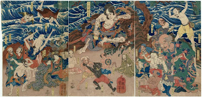
Work by Utagawa Kuniyoshi
Japanese Art Piece from 1797 - 1861
Woodblock Print; Ink and Color on Paper
I was originally drawn to this painting because of my love for Japanese culture.
From the food they eat, to their way of life in their highly advanced technological and artistic society,
I am fascinated, and wanted to know some of their history.
The artwork tells the story of Asahina, a warrior of the 12th century. In the work Asahina is surrounded
by representatives of the strange races he encountered on his journeys. Around him are pygmies, giants, winged people, dog-headed men, mythological creatures, people from india, siam and the "Land of Black People". All the people in the artwork share a love for sport, and Asahina is shown presiding over a sumo tournament.
In a way this artwork is glorifying the sport of sumo wrestling in Japan. It is from the MFA collection "Sumo: Japan's Big Sport". It is a tradition that dates back well into Japanese culture. The woodblock artworks show the combination of technical and artistic skills that japanese people and culture have always shown. The beautiful colors and designs are first produced by artists and then printers carved the design into the wood pieces and applied the color.
In the end the artwork is a beautiful representation of technical and artistic skills combined, aswell as
the beauty of the artistic qualities found in the Japanese tradition of sumo.
Where Do We Come From? What Are We? Where Are We Going?

Thursday, February 21, 2008
The Butcher...♦

1642
David Teniers II, the Younger, Flemish, 1610–1690
68.4 x 98 cm (26 15/16 x 38 9/16 in.)
Oil on panel
Museum of Fine Arts, Boston
(NOTE: All info taken from MFA Website)
The overall color of the painting is dark, although it does have some spotting of bright white and pink that pop out. Circular shapes recur in the bowls, plates, and body shapes in the people. A large rectangle dominates the center (the carcass) and it also contains a smaller one turned on its side (the towel). Much of the background is cast in shadow, except a window set high in the shop.
The narrative is clearly a day-in-the-life type story. A typical day as a butcher in a rather large city (indicated by the tall buildings seen in the high window). The only symbolism I can see is how life and death are so closely intertwined, as made clear by the left and right visual fields. Some distortion can be seen in the background. The man standing at us looks rather short. This may be because he is a short man, or to make him less significant in the painting, since he is the only human figure to be seen from the front.
All of the figures are contained within the frame, only the background and room itself go off the frame. Because this is not an imitation of a photograph all the figures are purposefully put in frame. The viewer is placed on the same level as the image, probably to make us feel as if we had walked in and are looking at this scene in real life. The image is a miniature of real life, only about 2' x 3'. I don't think this has any meaning, just a manageable size to paint and display.
This in an oil painting on a wooden panel background. The artist uses the oil-based paint to create a detailed painting but not in a photo-realistic way. This work caught my eye because it stood out against all the other paintings around it. The bright colored flesh and gruesome nature of the narrative drew my eye to it.
On the "picture plane" I would place this painting close to realism, but slightly toward abstraction due to the graininess of the painting and the minor use of large brushstrokes.
Tuesday, February 19, 2008
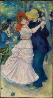
Dance at Bougival
1883
Pierre-Auguste Renoir, French, 1841-1919
181.9 x 98.1 cm (71 5/8 x 38 5/8 in.)
Oil on canvas
Classification: Paintings
Type, sub-type: Genre- Exterior
On view in the: Sidney and Esther Rabb Gallery (European Art 1870-1900)
The open-air cafés of suburban Bougival, on the Seine outside Paris, were popular recreation spots for city dwellers, including the Impressionist painters. Renoir, who was primarily a figure painter, uses intense color and lush brushwork to heighten the sense of pleasure conveyed by the whirling couple who dominate the composition. The woman's face, framed by her red bonnet, is the focus of attention, both ours and her companion's.
The dominant contrast of this painting is focusing on a central pattern of blue, red, and yellow upon your first glance. The dancing couple seems to be the primary focal point, and social conversation seems to follow close behind them. A circular shape is happening throughout, beginning from the woman’s red bonnet, onto her face, towards the man’s yellow fedora, down to the floor focusing on the woman’s flowing ruffles at the bottom of her dress, onto the ground to focus on the distinct purple lilac flower. It looks as though the man is completely enticed by the woman, only concentrating on her. Yet, the woman seems to be less than interested in returning such a look, and instead appears to be thinking about something completely unrelated to the present moment. Meanwhile, the background visual does not have as clear of a focus, but allows onlookers to believe that they are in a lively place with much happiness and conversation occurring. The scenery washes away in the distance, but still is present enough to allow the onlooker to depict the setting. It could be quite possible that Renoir is trying to place us within the image, possibly watching the couple dance while sitting at a table in front of them amongst the crowd.
In relation to Scott McCloud’s “picture plane” has simple complexity to it. Upon your first glance it is self-explanatory as to what is going on. Yet, looking further into the painting you are focused on the woman’s facial expression for she is distracted from what seems to be a pleasant dance. She has drawn your eye in so much that one forgets about what else is happening behind or beside her. She has completely taken over the portrait with her diverted eyes. The painting itself could be very realistic, for it is at a café just outside of Paris during the late 1800’s. The woman and man are both dressed appropriately for the times, and it seems to be subjective towards the audience. This painting is quite universal because of the dancing and expression between the two individuals. Overall the caption of the woman’s porcelain face with such an inattentive gaze makes this painting more complex than one would have observed from just a single glance.
Monday, February 18, 2008
Old Media
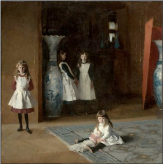
The Daughters of Edward Darley Boit
John Singer Sargent
1882
Oil on Canvas
The Daughters of Edward Darley Boit is a beautifully articulated expression of youth and the relationship among children as they grow through different stages of adolescence. The painting is quite large at 7.28 feet (87 3/8 in) x 7.3 feet (87 5/8 in) and is oil on canvas. The color scheme seems realistic to the time period and looks like a picture taken from just that moment.
Reading an Image
The dominant contrasts between light and dark are the most obvious with the white aprons each daughter is wearing contrasting with the dark background of the hallway behind the two eldest daughters. More specifically the girls are each wearing dark tights under their individually colored dresses which contrast also with their white aprons on top. The youngest daughter sitting on the floor holding her doll, is wearing a light almost white colored dress under her white apron, while the second youngest daughter standing to the left is wearing a red dress under her white apron, meanwhile the oldest two girls are both wearing a dark color, perhaps green or blue, contrasting with their white aprons.
The figure(s) in this painting are four girls, daughters, who are the subject of the piece. The youngest is in the foreground, sitting on the blue and grey carpet holding a toy. The second youngest is standing to the left behind the youngest on the floor. The oldest sisters are standing in the back of the younger two, huddled together, in the center background. Behind the eldest sisters is a dark hallway lined with possible book shelves and paintings, leading to what seems like other parts of the house.
Upon first glancing at the picture the eye is drawn immediately to the white of the aprons on each girl. My eye is drawn to the second youngest daughter in the red dress standing to the left. I notice her first because the white of her apron is the brightest. Perhaps when the artist was painting this picture, the light was predominantly coming from a window on the left side of the room, casting light on her the most. Also her red dress underneath her apron is eye catching, compared to the other girls, with duller, darker colors. I notice the little one sitting on the floor as well. She sits in the middle of the floor, closest to us and is the smallest. Other focal points in the picture are the large blue and white vases' on both the right and middle/left side of the room.
There is a theme of blue/white/grey within the life-size vases and the carpet the youngest girl is sitting on. Also the white apron is a common theme amongst all four daughters.
There is blatant symbolism within the way the girls are positioned in the picture. It represents the stages of youth and adolescence. The youngest one looks maybe 3 years old. She is sitting on the floor with her doll, playing alone. She has a playful, curious expression on her face and seems quite content. The second oldest girl standing to the left seems lonely and out of place. She looks about 6 years old and is too old to want to play with the little one, but not quite old enough to fit in with her oldest two sisters standing behind her. The oldest two sisters seem "clicky" and exclusive in the group they have made between themselves. The second oldest is standing facing the artist and seems maybe 9 or 10 years old. Her older companion is facing away from everyone except her second oldest sister and seems uncompromising and unaccepting of the younger two.
The picture only captures what seems like a corner or portion of a bedroom or playroom of some kind. We can't see a bed, but the youngest daughter is sitting on a carpet that is we can only see the left upper corner of. It leaves the rest of the room and house up to our imagination, but with these basic guidelines the artist has already laid out for us.
The viewer's perspective is what looks like an upper left corner of a rather large room. We, as the onlooker, are placed at the same height as the subjects in the painting. The artist could have been painting the children of family or friends.
The artist uses oil paint on canvas and is able to very convincingly depict real life. By using oil paint, it is easier to show the reflecting of light and the necessary details in painting true life.
The images in the picture are displayed as they were in true life, natural living environment. The girls are depicted playing, inside a home- a daily activity.
The relations of looking in the painting
There are four images in the picture and they are all gazing at the artist except for the eldest daughter in the back left, leaning up against the blue and white vase. She has her body turned away from the other girls and is facing the girl immediately to the right, the second oldest daughter. Her standing away from the youngest two sisters seems to say that she can't be bothered with playing with them, she is too old to be associated with any childhood nonsense. The other three daughters are looking back at us the viewer, and the artist.
As the viewer we are looking at the subjects the way the artist did while painting the picture.
The artist created the artwork from a head on perspective. Three out of the four girls are looking right at the artist and us, the viewer, although the frame of the picture seems like it could be from a corner of a room.
Picture Plane: realism and abstraction
Along the lines of Scott McCloud's triangle picture plane, The Daughters of Edward Darley Boit is very realistic, almost like a photograph. It resembles the human form very closely, but is not a photo itself. The piece lies on the far left side of realism, but not on the very corner, as a photo would. The picture is objective in the sense that the artist paints the images just the way they looked. There isn't much left to the viewer's imagination.
Old Media and the Old Testament
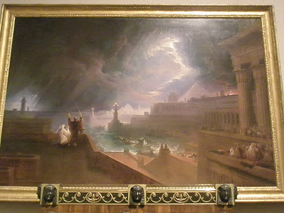
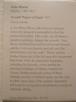
Pictured above is John Martin's Seventh Plague of Egypt painting from 1823. The medium is oil painting.
(Note: a lot of this information came from the description pictured under the painting.) The source of the image is from the book of Exodus in the Old Testament. Specifically during Moses' calling for the seventh plague of hail and fire and God's subsequent delivery of said disturbances. Moses and his brother Aaron are the figures in this image. Moses being featured more prominently, standing upright with his hands to the sky. The Egyptian city of Thebes and the stormy sky above it form the background of the painting, but also sort of the focus, as it is much more expansive than Moses' figure. It's also my favorite part of the painting. To me, it's a bit surreal and borderline sci-fi. Pyramids being featured in the same skyline as daunting towers and grand, columned edifices? Not to mention the very cold way that the water and sky are painted. For whatever reason, it looks alien to me.
There seem to be two main, opposing focal points. Those being Moses in the bottom left corner and the white streak/break in the sky in the top right corner. And taken together, maybe they form one main focal point somewhere near the horizon line. This is also where the main light/dark contrast lies. Everything surrounding this center is a lot darker. There are two main color schemes, that are used to distinguish between the land/architecture and nature. The architecture and Moses are colored in warm, browns and reds, while the sky and sea get these cold blues and purples. It's an interesting reversal of what I usually associate with "warm" and "cold" colors. This distinction carries into shape as well where the buildings are made of mostly clean straight lines and nature is more messy and ambiguous shape-wise.
The narrative, as I briefly pointed out before is Moses getting God to rain down some fire and hail on the city of Thebes, Egypt. He wants the Pharaoh to free the Israelites. "Let my people go." The Bible seems to be a lot of metaphor and symbolism (something a lot of people don't care to understand), but I'm horrible at analyzing it. The atheist in me says the subject matter of the Bible is all too convoluted to care about or dissect, but that's probably a little too ignorant. Let's just say this has to do with "freedom" and "natural disasters."
Distortion in the image is more about distorting ideas than physical things. I don't doubt that storms of this magnitude have happened, there are certainly some great pictures of them out there. But the idea of a human being able to summon plagues/natural disasters from the heavens is certainly a distortion of the real world. That's just not possible, though it certainly makes for some good sci-fi and an awesome painting here.
The viewer is placed at a considerable distance from the most vibrant part of the storm. The effects of the storm seem to be at a "safe" distance. And the perspective is above Moses, but still a considerable distance under the sky. Maybe it means that there's a certain amount of "historical" (read: fictional) removal, because the subject matter comes from a pre-existing document. From what I remember, it was a pretty big painting. It mirrors the subject matter in it's larger scale and grandiosity. The oil painting is probably best exemplified in the portrayal of the sky. As I said before, it's ambiguous in shape, very swirly and gauzy. This is a religious painting done in the "English school" style (according to Wikipedia). The subject matter is very much non-English in origin, but the text of the Bible has since been adapted by many people, so I guess you could say it was "universal" at the point of the painting. It's displayed in a golden frame with some Egyptian heads/masks displayed on the bottom of it, connecting it to the Egyptian location of the painting.
Moses is looking to the skies, and we can choose to either look at Moses, the skies or the landscape. It's all pretty mesmerizing and worth looking at. I guess I'm still somewhat confused on the "looking" thing. It falls close to "realism" on the scale simply based on how it's rendered, but it might sit somewhere in the middle, because the subject matter implicates a certain amount of abstraction.
All that aside, John Martin is just a really cool painter. I'm not exactly sure why his style appeals to me, maybe it's just how grand everything is. And the portrayal of things I'd probably never see in real life painted in a realistic way is also interesting to me. Check out this other religious painting of his called The Destruction of Sodom and Gomorrah:

This painting wouldn't seem out of place as an album cover for a metal band. Observe my Photoshopping prowess:

Tuesday, February 12, 2008
Art within Art
Behind the Scenes
The MFA's Vast collecting always impresses me. This trip I noticed a large ink well from Spain. The maker was unknown but it was very well done. Their were side chambers for writing implements and it was covered in painted glass to look like a forest scene. I was impressed due to the fact that it was useful and beautiful. I would have a picture but my phone wouldn't pass it to the computer. I'll go back and snap a real one. Thanks, Lucas.
the rotunda

I've been to the MFA too many times to count and usually I end up wandering to the same sections looking at the same works of art. I'm perfectly content with this; I get a certain satisfaction when I look at the painting of a small child with a little person playing along with him. My MFA routine always takes me to the Medieval works of art because of my fascination with their culture and especially their music. After my fill of Medieval religious art I then make my way to the French works, and then finally my way out of the museum.
Our first visit to the MFA had taken me to a place I had never been before... the first floor with American art. I'm not sure why, but I never had the urge to see what Americans were doing in the history of the art world. The newness of our country doesn't appeal to me. I like the old, I like the broken down, and I like imagining what it must have been like hundreds of years ago. To be perfectly honest, I was not that impressed. There were a couple works by past SMFA students that I LOVED, but my overall impression was indifferent.
What really impressed me downstairs was the view of the rotunda. I had never seen the rotunda directly in the center, but alas, I looked straight up and I was drawn in by the light and symmetry of the ceiling. It was a beautiful image that really made me think about how much patience, thought, and care goes into creating such a massive piece of art. It really is awe inspiring. Music is an instant gratification art; we can bust out a song way faster than a painter can produce a painting.
The camera phone photo doesn't do justice to the scene.
Monday, February 11, 2008
A First Impression(ism)
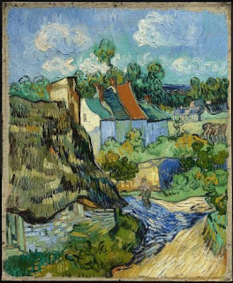 I have always appreciated the beauty of impressionism. My eye was always drawn to the paintings in my art books. But looking up close at one of these masterpieces, being able to see the paint rise up from the canvas and the curve of the artist's stroke showed me what impressionism really is. My up-close examination and the "This is not a pipe" picture both made realize the true idea behind it.
Beauty of Impracticality...
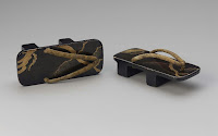
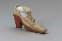

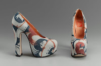

Because I was away, I didn't get to visit the MFA with the rest of the class. At first I felt some kind of relief, having always had bad experiences on class trips to the Toronto Museum with my highschool and elementary classes (that just never seemed to end). After checking out what they had I was actually pleasantly suprised to find the "Walk this Way" Collection.
I am person who takes the ancient artworks, and historical masterpieces to heart, but rarely has the patience to take the time to analyze them.
I'm more of person who is addicted and enthraled in the modern forms of artwork and expression that surround me on daily basis and directly affect my life. This is one of the many reasons I was so attracted to this course in the first place.
That being said, I wear clothes everyday, and can truthfully say I'm probably a little obessed with the whole idea. Its one of those many things that I consider to be such an amazing form of art that really gets to me day to day. I was pleased to find "Walk This Way" with such a focus on fashion itself.
When viewing the collection I started to think about what we as humans really need on our feet to be supported and comfortable etc. and then started comparing that to what was being displayed. There was all the unecessary frills and laces, heels and soles, different types of materials, different heights and time periods, and I saw that we have always been attracted to the idea of going further than whats required. We've always been drawn to that little something extra.
We've always found beauty in the impractical.
I really liked realizing all this when viewing the collection. I've just always been bothered by the question when people ask "Why do you shop so much", or "Why do you worry so much about clothes, shoes, your appearance etc...
I realized I'm just one of many who sees art as something wearable. I see effort and work being put into bettering yourself and your outward appearance. Even if your not the one creating it, your using it. The clothes/shoes become your paints, and you combine them to create an image, an artwork. I just think its a really awesome beautiful thing.
Got a little carried away there haha. Thats all for now ;)

