Friday, February 29, 2008
SMFA Traveling Scholars Exhibit
Thursday, February 28, 2008
Something I never noticed about the MFA
I have lived in Boston for the past 4 years, and I really can't recall how many times I have been to the MFA. I do remember the first time I went, and how I was in awe at the quantity and quality of the art displayed in this amazing museum. Every time I step into this building, I feel inspired and free to explore the history of humanity through art.
When we went to the MFA for the first time this semester, I was excited to see the new constructions going on and the expansion of this great museum. We entered through the side and walked to the main entrance. This entrance I had seen before but never really payed attention to how grand it was. We talked about the this part of the museum and my eyes where open to a whole new concept. When Dr. Landay said, "Think of the museum as a piece of literature," this was a new way of conceptualizing the museum which had never crossed my mind.
I started to notice how complete the museum's collection is, and how the museum has a purpose. It has ancient art, classical art, modern art, musical instruments; you name it and the MFA has it. It's literally a history book, that explores humanity from all cultural perspectives and gives light to many aspects of our history. The building is also historic, and adds to the experience.
Now, every time I go to any museum, I will try to think of the museum itself as a work of art. Even other museums I have visited before now have a new purpose, and they each have a different approach to displaying art. MOMA in NYC tells a different story to the one the Centre Pompidou in Paris does; and the MFA and Louvre also tell similar but different stories. A museum is not just an amazing building with great art as it was before; it's now a work of art in itself.
Tuesday, February 26, 2008
First Time to the MFA
Friday, February 22, 2008
Visual Culture - Old Media - MFA

Work by Utagawa Kuniyoshi
Japanese Art Piece from 1797 - 1861
Woodblock Print; Ink and Color on Paper
I was originally drawn to this painting because of my love for Japanese culture.
From the food they eat, to their way of life in their highly advanced technological and artistic society,
I am fascinated, and wanted to know some of their history.
The artwork tells the story of Asahina, a warrior of the 12th century. In the work Asahina is surrounded
by representatives of the strange races he encountered on his journeys. Around him are pygmies, giants, winged people, dog-headed men, mythological creatures, people from india, siam and the "Land of Black People". All the people in the artwork share a love for sport, and Asahina is shown presiding over a sumo tournament.
In a way this artwork is glorifying the sport of sumo wrestling in Japan. It is from the MFA collection "Sumo: Japan's Big Sport". It is a tradition that dates back well into Japanese culture. The woodblock artworks show the combination of technical and artistic skills that japanese people and culture have always shown. The beautiful colors and designs are first produced by artists and then printers carved the design into the wood pieces and applied the color.
In the end the artwork is a beautiful representation of technical and artistic skills combined, aswell as
the beauty of the artistic qualities found in the Japanese tradition of sumo.
Where Do We Come From? What Are We? Where Are We Going?

Thursday, February 21, 2008
The Butcher...♦

1642
David Teniers II, the Younger, Flemish, 1610–1690
68.4 x 98 cm (26 15/16 x 38 9/16 in.)
Oil on panel
Museum of Fine Arts, Boston
(NOTE: All info taken from MFA Website)
The overall color of the painting is dark, although it does have some spotting of bright white and pink that pop out. Circular shapes recur in the bowls, plates, and body shapes in the people. A large rectangle dominates the center (the carcass) and it also contains a smaller one turned on its side (the towel). Much of the background is cast in shadow, except a window set high in the shop.
The narrative is clearly a day-in-the-life type story. A typical day as a butcher in a rather large city (indicated by the tall buildings seen in the high window). The only symbolism I can see is how life and death are so closely intertwined, as made clear by the left and right visual fields. Some distortion can be seen in the background. The man standing at us looks rather short. This may be because he is a short man, or to make him less significant in the painting, since he is the only human figure to be seen from the front.
All of the figures are contained within the frame, only the background and room itself go off the frame. Because this is not an imitation of a photograph all the figures are purposefully put in frame. The viewer is placed on the same level as the image, probably to make us feel as if we had walked in and are looking at this scene in real life. The image is a miniature of real life, only about 2' x 3'. I don't think this has any meaning, just a manageable size to paint and display.
This in an oil painting on a wooden panel background. The artist uses the oil-based paint to create a detailed painting but not in a photo-realistic way. This work caught my eye because it stood out against all the other paintings around it. The bright colored flesh and gruesome nature of the narrative drew my eye to it.
On the "picture plane" I would place this painting close to realism, but slightly toward abstraction due to the graininess of the painting and the minor use of large brushstrokes.
Tuesday, February 19, 2008

Dance at Bougival
1883
Pierre-Auguste Renoir, French, 1841-1919
181.9 x 98.1 cm (71 5/8 x 38 5/8 in.)
Oil on canvas
Classification: Paintings
Type, sub-type: Genre- Exterior
On view in the: Sidney and Esther Rabb Gallery (European Art 1870-1900)
The open-air cafés of suburban Bougival, on the Seine outside Paris, were popular recreation spots for city dwellers, including the Impressionist painters. Renoir, who was primarily a figure painter, uses intense color and lush brushwork to heighten the sense of pleasure conveyed by the whirling couple who dominate the composition. The woman's face, framed by her red bonnet, is the focus of attention, both ours and her companion's.
The dominant contrast of this painting is focusing on a central pattern of blue, red, and yellow upon your first glance. The dancing couple seems to be the primary focal point, and social conversation seems to follow close behind them. A circular shape is happening throughout, beginning from the woman’s red bonnet, onto her face, towards the man’s yellow fedora, down to the floor focusing on the woman’s flowing ruffles at the bottom of her dress, onto the ground to focus on the distinct purple lilac flower. It looks as though the man is completely enticed by the woman, only concentrating on her. Yet, the woman seems to be less than interested in returning such a look, and instead appears to be thinking about something completely unrelated to the present moment. Meanwhile, the background visual does not have as clear of a focus, but allows onlookers to believe that they are in a lively place with much happiness and conversation occurring. The scenery washes away in the distance, but still is present enough to allow the onlooker to depict the setting. It could be quite possible that Renoir is trying to place us within the image, possibly watching the couple dance while sitting at a table in front of them amongst the crowd.
In relation to Scott McCloud’s “picture plane” has simple complexity to it. Upon your first glance it is self-explanatory as to what is going on. Yet, looking further into the painting you are focused on the woman’s facial expression for she is distracted from what seems to be a pleasant dance. She has drawn your eye in so much that one forgets about what else is happening behind or beside her. She has completely taken over the portrait with her diverted eyes. The painting itself could be very realistic, for it is at a café just outside of Paris during the late 1800’s. The woman and man are both dressed appropriately for the times, and it seems to be subjective towards the audience. This painting is quite universal because of the dancing and expression between the two individuals. Overall the caption of the woman’s porcelain face with such an inattentive gaze makes this painting more complex than one would have observed from just a single glance.
Monday, February 18, 2008
Old Media

The Daughters of Edward Darley Boit
John Singer Sargent
1882
Oil on Canvas
The Daughters of Edward Darley Boit is a beautifully articulated expression of youth and the relationship among children as they grow through different stages of adolescence. The painting is quite large at 7.28 feet (87 3/8 in) x 7.3 feet (87 5/8 in) and is oil on canvas. The color scheme seems realistic to the time period and looks like a picture taken from just that moment.
Reading an Image
The dominant contrasts between light and dark are the most obvious with the white aprons each daughter is wearing contrasting with the dark background of the hallway behind the two eldest daughters. More specifically the girls are each wearing dark tights under their individually colored dresses which contrast also with their white aprons on top. The youngest daughter sitting on the floor holding her doll, is wearing a light almost white colored dress under her white apron, while the second youngest daughter standing to the left is wearing a red dress under her white apron, meanwhile the oldest two girls are both wearing a dark color, perhaps green or blue, contrasting with their white aprons.
The figure(s) in this painting are four girls, daughters, who are the subject of the piece. The youngest is in the foreground, sitting on the blue and grey carpet holding a toy. The second youngest is standing to the left behind the youngest on the floor. The oldest sisters are standing in the back of the younger two, huddled together, in the center background. Behind the eldest sisters is a dark hallway lined with possible book shelves and paintings, leading to what seems like other parts of the house.
Upon first glancing at the picture the eye is drawn immediately to the white of the aprons on each girl. My eye is drawn to the second youngest daughter in the red dress standing to the left. I notice her first because the white of her apron is the brightest. Perhaps when the artist was painting this picture, the light was predominantly coming from a window on the left side of the room, casting light on her the most. Also her red dress underneath her apron is eye catching, compared to the other girls, with duller, darker colors. I notice the little one sitting on the floor as well. She sits in the middle of the floor, closest to us and is the smallest. Other focal points in the picture are the large blue and white vases' on both the right and middle/left side of the room.
There is a theme of blue/white/grey within the life-size vases and the carpet the youngest girl is sitting on. Also the white apron is a common theme amongst all four daughters.
There is blatant symbolism within the way the girls are positioned in the picture. It represents the stages of youth and adolescence. The youngest one looks maybe 3 years old. She is sitting on the floor with her doll, playing alone. She has a playful, curious expression on her face and seems quite content. The second oldest girl standing to the left seems lonely and out of place. She looks about 6 years old and is too old to want to play with the little one, but not quite old enough to fit in with her oldest two sisters standing behind her. The oldest two sisters seem "clicky" and exclusive in the group they have made between themselves. The second oldest is standing facing the artist and seems maybe 9 or 10 years old. Her older companion is facing away from everyone except her second oldest sister and seems uncompromising and unaccepting of the younger two.
The picture only captures what seems like a corner or portion of a bedroom or playroom of some kind. We can't see a bed, but the youngest daughter is sitting on a carpet that is we can only see the left upper corner of. It leaves the rest of the room and house up to our imagination, but with these basic guidelines the artist has already laid out for us.
The viewer's perspective is what looks like an upper left corner of a rather large room. We, as the onlooker, are placed at the same height as the subjects in the painting. The artist could have been painting the children of family or friends.
The artist uses oil paint on canvas and is able to very convincingly depict real life. By using oil paint, it is easier to show the reflecting of light and the necessary details in painting true life.
The images in the picture are displayed as they were in true life, natural living environment. The girls are depicted playing, inside a home- a daily activity.
The relations of looking in the painting
There are four images in the picture and they are all gazing at the artist except for the eldest daughter in the back left, leaning up against the blue and white vase. She has her body turned away from the other girls and is facing the girl immediately to the right, the second oldest daughter. Her standing away from the youngest two sisters seems to say that she can't be bothered with playing with them, she is too old to be associated with any childhood nonsense. The other three daughters are looking back at us the viewer, and the artist.
As the viewer we are looking at the subjects the way the artist did while painting the picture.
The artist created the artwork from a head on perspective. Three out of the four girls are looking right at the artist and us, the viewer, although the frame of the picture seems like it could be from a corner of a room.
Picture Plane: realism and abstraction
Along the lines of Scott McCloud's triangle picture plane, The Daughters of Edward Darley Boit is very realistic, almost like a photograph. It resembles the human form very closely, but is not a photo itself. The piece lies on the far left side of realism, but not on the very corner, as a photo would. The picture is objective in the sense that the artist paints the images just the way they looked. There isn't much left to the viewer's imagination.
Old Media and the Old Testament


Pictured above is John Martin's Seventh Plague of Egypt painting from 1823. The medium is oil painting.
(Note: a lot of this information came from the description pictured under the painting.) The source of the image is from the book of Exodus in the Old Testament. Specifically during Moses' calling for the seventh plague of hail and fire and God's subsequent delivery of said disturbances. Moses and his brother Aaron are the figures in this image. Moses being featured more prominently, standing upright with his hands to the sky. The Egyptian city of Thebes and the stormy sky above it form the background of the painting, but also sort of the focus, as it is much more expansive than Moses' figure. It's also my favorite part of the painting. To me, it's a bit surreal and borderline sci-fi. Pyramids being featured in the same skyline as daunting towers and grand, columned edifices? Not to mention the very cold way that the water and sky are painted. For whatever reason, it looks alien to me.
There seem to be two main, opposing focal points. Those being Moses in the bottom left corner and the white streak/break in the sky in the top right corner. And taken together, maybe they form one main focal point somewhere near the horizon line. This is also where the main light/dark contrast lies. Everything surrounding this center is a lot darker. There are two main color schemes, that are used to distinguish between the land/architecture and nature. The architecture and Moses are colored in warm, browns and reds, while the sky and sea get these cold blues and purples. It's an interesting reversal of what I usually associate with "warm" and "cold" colors. This distinction carries into shape as well where the buildings are made of mostly clean straight lines and nature is more messy and ambiguous shape-wise.
The narrative, as I briefly pointed out before is Moses getting God to rain down some fire and hail on the city of Thebes, Egypt. He wants the Pharaoh to free the Israelites. "Let my people go." The Bible seems to be a lot of metaphor and symbolism (something a lot of people don't care to understand), but I'm horrible at analyzing it. The atheist in me says the subject matter of the Bible is all too convoluted to care about or dissect, but that's probably a little too ignorant. Let's just say this has to do with "freedom" and "natural disasters."
Distortion in the image is more about distorting ideas than physical things. I don't doubt that storms of this magnitude have happened, there are certainly some great pictures of them out there. But the idea of a human being able to summon plagues/natural disasters from the heavens is certainly a distortion of the real world. That's just not possible, though it certainly makes for some good sci-fi and an awesome painting here.
The viewer is placed at a considerable distance from the most vibrant part of the storm. The effects of the storm seem to be at a "safe" distance. And the perspective is above Moses, but still a considerable distance under the sky. Maybe it means that there's a certain amount of "historical" (read: fictional) removal, because the subject matter comes from a pre-existing document. From what I remember, it was a pretty big painting. It mirrors the subject matter in it's larger scale and grandiosity. The oil painting is probably best exemplified in the portrayal of the sky. As I said before, it's ambiguous in shape, very swirly and gauzy. This is a religious painting done in the "English school" style (according to Wikipedia). The subject matter is very much non-English in origin, but the text of the Bible has since been adapted by many people, so I guess you could say it was "universal" at the point of the painting. It's displayed in a golden frame with some Egyptian heads/masks displayed on the bottom of it, connecting it to the Egyptian location of the painting.
Moses is looking to the skies, and we can choose to either look at Moses, the skies or the landscape. It's all pretty mesmerizing and worth looking at. I guess I'm still somewhat confused on the "looking" thing. It falls close to "realism" on the scale simply based on how it's rendered, but it might sit somewhere in the middle, because the subject matter implicates a certain amount of abstraction.
All that aside, John Martin is just a really cool painter. I'm not exactly sure why his style appeals to me, maybe it's just how grand everything is. And the portrayal of things I'd probably never see in real life painted in a realistic way is also interesting to me. Check out this other religious painting of his called The Destruction of Sodom and Gomorrah:

This painting wouldn't seem out of place as an album cover for a metal band. Observe my Photoshopping prowess:

Tuesday, February 12, 2008
Art within Art
Behind the Scenes
The MFA's Vast collecting always impresses me. This trip I noticed a large ink well from Spain. The maker was unknown but it was very well done. Their were side chambers for writing implements and it was covered in painted glass to look like a forest scene. I was impressed due to the fact that it was useful and beautiful. I would have a picture but my phone wouldn't pass it to the computer. I'll go back and snap a real one. Thanks, Lucas.
the rotunda

I've been to the MFA too many times to count and usually I end up wandering to the same sections looking at the same works of art. I'm perfectly content with this; I get a certain satisfaction when I look at the painting of a small child with a little person playing along with him. My MFA routine always takes me to the Medieval works of art because of my fascination with their culture and especially their music. After my fill of Medieval religious art I then make my way to the French works, and then finally my way out of the museum.
Our first visit to the MFA had taken me to a place I had never been before... the first floor with American art. I'm not sure why, but I never had the urge to see what Americans were doing in the history of the art world. The newness of our country doesn't appeal to me. I like the old, I like the broken down, and I like imagining what it must have been like hundreds of years ago. To be perfectly honest, I was not that impressed. There were a couple works by past SMFA students that I LOVED, but my overall impression was indifferent.
What really impressed me downstairs was the view of the rotunda. I had never seen the rotunda directly in the center, but alas, I looked straight up and I was drawn in by the light and symmetry of the ceiling. It was a beautiful image that really made me think about how much patience, thought, and care goes into creating such a massive piece of art. It really is awe inspiring. Music is an instant gratification art; we can bust out a song way faster than a painter can produce a painting.
The camera phone photo doesn't do justice to the scene.
Monday, February 11, 2008
A First Impression(ism)
 I have always appreciated the beauty of impressionism. My eye was always drawn to the paintings in my art books. But looking up close at one of these masterpieces, being able to see the paint rise up from the canvas and the curve of the artist's stroke showed me what impressionism really is. My up-close examination and the "This is not a pipe" picture both made realize the true idea behind it.
Beauty of Impracticality...


Because I was away, I didn't get to visit the MFA with the rest of the class. At first I felt some kind of relief, having always had bad experiences on class trips to the Toronto Museum with my highschool and elementary classes (that just never seemed to end). After checking out what they had I was actually pleasantly suprised to find the "Walk this Way" Collection.
I am person who takes the ancient artworks, and historical masterpieces to heart, but rarely has the patience to take the time to analyze them.
I'm more of person who is addicted and enthraled in the modern forms of artwork and expression that surround me on daily basis and directly affect my life. This is one of the many reasons I was so attracted to this course in the first place.
That being said, I wear clothes everyday, and can truthfully say I'm probably a little obessed with the whole idea. Its one of those many things that I consider to be such an amazing form of art that really gets to me day to day. I was pleased to find "Walk This Way" with such a focus on fashion itself.
When viewing the collection I started to think about what we as humans really need on our feet to be supported and comfortable etc. and then started comparing that to what was being displayed. There was all the unecessary frills and laces, heels and soles, different types of materials, different heights and time periods, and I saw that we have always been attracted to the idea of going further than whats required. We've always been drawn to that little something extra.
We've always found beauty in the impractical.
I really liked realizing all this when viewing the collection. I've just always been bothered by the question when people ask "Why do you shop so much", or "Why do you worry so much about clothes, shoes, your appearance etc...
I realized I'm just one of many who sees art as something wearable. I see effort and work being put into bettering yourself and your outward appearance. Even if your not the one creating it, your using it. The clothes/shoes become your paints, and you combine them to create an image, an artwork. I just think its a really awesome beautiful thing.
Got a little carried away there haha. Thats all for now ;)
Friday, February 8, 2008
New to Me


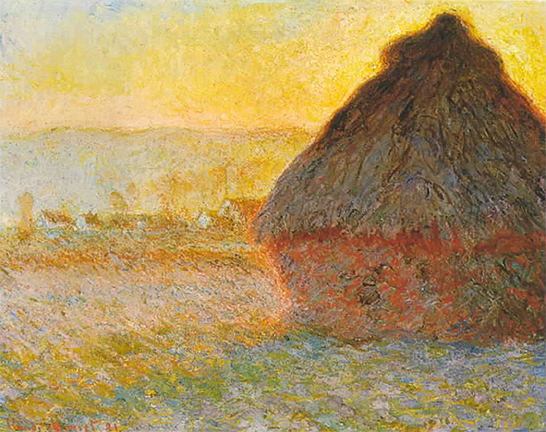
One of my favorite spots in the MFA is the impressionism and post-impressionism collection. Our teacher mentioned a particularly interesting series of paintings by Monet that used to be represented in this collection. They were his studies on the seasonal colors of haystacks. For whatever reason, I was always drawn to them. It could be because they were explained during my Art History course, so I felt I had an "understanding" of them and thus, a reason to stare.
So I expected to see them when the class was in this part of the museum, but what do you know? They were gone. My initial disappointment was replaced by excitement and joy when I discovered that two pointillist paintings had replaced them. I'm not sure I've ever seen pointillist paintings in person until then, so I was pretty wowed. They just look cool, you know?
Anyway, these two paintings are what stood out most to me at the museum. Further online research (er... Googling) led to some more interesting pointillist paintings, specifically by Paul Signac. Peep this self-portrait he did. Sgt. Pepper, eat your heart out.


"first" visit...
Not sure if I'm the only one, but this "tour" through art basically felt like a crash course to all the visits I took in Art History I and II. Not saying this a bad thing, because it was a great refresher, but it didn't allow me to really notice anything new or different in the artwork. One thing I did observe was the architecture of the museum.
When we first walked up the steps into the open dome-like room, I was quite amazed. I had never seen this before in the museum. The paintings on the ceiling, which I thought were originals from antiquity, are actually contemporary works of art specifically designed for the Museum. This is interesting to me, as the museum is trying to look like an ancient European place a worship, far from anything American.
Why would they decide to design the building like this? I'm not sure, but maybe the designers we're secure with the American style at the time of it's creation. I'm just speculating here, as I have no knowledge of the time period, the architects, or the intention of the design.
I was going to try and upload some images, of the dome, and some of the sculpture adorning the walls, but there were complications (i.e. error uploading). Oh well.
Thursday, February 7, 2008


Since I have been to the museum many times and looked at almost all of the same galleries from previous visits, it was difficult for me to initially find something that really stood out. However, when walking though the European Gallery the "Walk This Way" display really caught my eye. This presentation of Parada's Miu Miu shoes seemed to be very interesting, for I had never noticed something so unique at this Museum before. This pair of women's "Mary Jane" wooden platform wedges covered with red patent leather is truly beautiful.
Tuesday, February 5, 2008
My trip to the MFA


